Dear Python, Why Are You So Ugly?
Dear Python, something has been bothering me for a while. Its just that, well, ummm…you’re kind of ugly. Look, you are beautiful inside: Python is a beautiful language and the Python community is open and welcoming. But Python resources are ugly enough to affect usability and adoption. This is damaging to the community.
Documentation and tutorials are often difficult to navigate. Products built with Python don’t put any thought into design. Blogging software written in Python helps create more ugly blogs about Python. Pythonistas just don’t care about presentation.
Let’s compare the usability and design of some different Python and Ruby sites. Ruby is a good reference point since it occupies a similar niche in the programming language ecosystem and is roughly the same age.
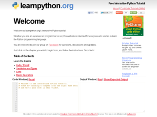
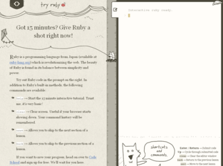
Above are online interactive tutorials for learning Python vs. Ruby. Learnpython.org isn’t ugly exactly, it’s just that Try Ruby is so much more polished. It’s obvious that a professional designer had a hand in Try Ruby, whereas the design of learnpython.org was thrown together by a programmer who later slapped a few ads on it and called it done. Which tutorial would you rather use?
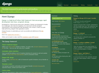
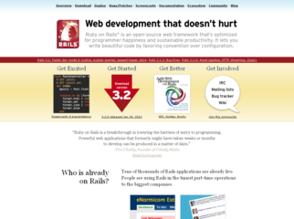
Here are the homepages for Django and Ruby on Rails, popular web frameworks. Django’s homepage is poorly organized. The entire page is just a mess of links with no clear emphasis on anything. In contrast, the Ruby on Rails homepage does a good job of introducing people to Rails and pointing them to different areas of the site.
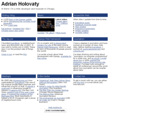
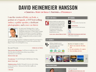
Homepage of Django co-creator Adrian Holovaty vs. Ruby on Rails creator David Heinemeier Hansson. Both are well organized, but it is obvious at a glance who places importance on professional design and who doesn’t.
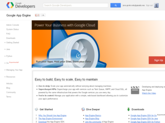
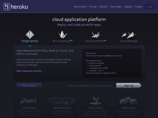
Cloud hosting: Google App Engine vs. Heroku. Once again the Ruby side is sexier.
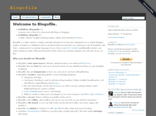
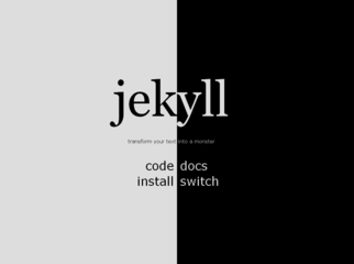
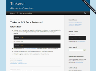
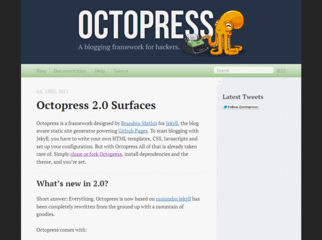
Python blogging software vs Ruby blogging software. The Python blog designs are uninspiring and unpolished, while the Ruby designs are striking. And who doesn’t love octopodes?
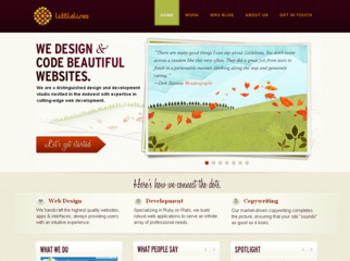
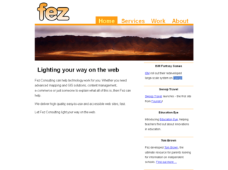
Some top Google search results for “python consulting” vs. “ruby consulting”. The Python results look painfully outdated.
Maybe Ruby has an advantage because it is more tightly focused on web programming? It seems likely that consultants for web apps would have nicer web pages than consultants working on, say, scientific problems. To eliminate any unfair advantage, below are some top Google search results for “django consulting” vs. “ruby on rails consulting”.
It doesn’t matter. Python is still the ugly duckling.
This wasn’t a scientific comparison – somebody could try show the opposite conclusion by cherry-picking a different set of sites – but I think the screenshots I used are pretty representative. I also think that most people who have spent a little bit of time in both communities will agree that Python sites are ugly compared to Ruby sites.
Why does this happen?
Either Pythonistas aren’t pairing with designers as often as Rubyists, Pythonistas have less design talent, or Pythonistas simply don’t care enough about design to spend the time to do it right. I’m not really sure which is the case.
Does it matter?
Yes! This stuff matters.
It’s not just that Python sites are ugly (even though they are). It’s that the uglyness makes sites hard to navigate and hard to use. It’s that nobody is inspired by uglyness and nobody wants to use ugly products when there are better options. Nobody wants to hire someone who builds ugly web apps. It is unprofessional and sloppy to be so ugly.
This damages the Python community.
How can we fix it?
If you are a Python coder (or any type of coder who doesn’t fully grok design), spend some time learning basic design principles. Try Design for Hackers, Bootstrapping Design, or Step by Step UI Design. [Edit: Also check out this lightening talk on attracting designers to your project.] Then make friends with designers and know when to call them.







Discussion on
Dear Python, Why Are You So Ugly?
by Jess Johnson in Programming Languages
68 Comments
12:38 pm UTC, 2012-04-26
1:43 pm UTC, 2012-04-26
1:51 pm UTC, 2012-04-26
2:03 pm UTC, 2012-04-26
2:05 pm UTC, 2012-04-26
2:21 pm UTC, 2012-04-26
2:41 pm UTC, 2012-04-26
3:15 pm UTC, 2012-04-26
3:33 pm UTC, 2012-04-26
3:51 pm UTC, 2012-04-26
3:53 pm UTC, 2012-04-26
3:56 pm UTC, 2012-04-26
3:56 pm UTC, 2012-04-26
4:00 pm UTC, 2012-04-26
4:23 pm UTC, 2012-04-26
4:38 pm UTC, 2012-04-26
4:45 pm UTC, 2012-04-26
4:54 pm UTC, 2012-04-26
5:51 pm UTC, 2012-04-26
6:20 pm UTC, 2012-04-26
6:25 pm UTC, 2012-04-26
6:30 pm UTC, 2012-04-26
6:37 pm UTC, 2012-04-26
6:42 pm UTC, 2012-04-26
8:39 pm UTC, 2012-04-26
9:18 pm UTC, 2012-04-26
10:14 pm UTC, 2012-04-26
11:18 pm UTC, 2012-04-26
12:35 am UTC, 2012-04-27
2:21 am UTC, 2012-04-27
7:23 am UTC, 2012-04-27
7:27 am UTC, 2012-04-27
6:43 pm UTC, 2012-04-27
11:00 pm UTC, 2012-04-27
4:30 pm UTC, 2012-04-28
9:49 pm UTC, 2012-04-29
7:27 am UTC, 2012-05-02
5:13 am UTC, 2012-05-03
5:22 am UTC, 2012-05-03
8:35 am UTC, 2012-05-03
3:53 pm UTC, 2012-05-03
8:24 pm UTC, 2012-05-03
5:09 pm UTC, 2012-05-10
3:15 pm UTC, 2012-05-23
12:41 am UTC, 2012-06-28
12:44 am UTC, 2012-06-28
12:51 am UTC, 2012-06-28
2:00 am UTC, 2012-07-14
5:04 pm UTC, 2012-08-03
12:26 am UTC, 2012-08-07
1:56 am UTC, 2012-08-24
7:44 pm UTC, 2012-09-11
6:01 am UTC, 2012-09-14
4:33 pm UTC, 2012-09-21
2:00 am UTC, 2013-02-09
2:02 am UTC, 2013-02-09
5:13 am UTC, 2013-08-14
4:32 am UTC, 2013-10-01
4:36 am UTC, 2013-10-01
4:42 am UTC, 2013-10-01
1:07 am UTC, 2014-02-20
1:27 am UTC, 2014-02-20
4:27 am UTC, 2014-02-20
1:54 pm UTC, 2014-02-20
12:37 am UTC, 2014-04-29
5:56 am UTC, 2015-04-22
4:06 pm UTC, 2016-03-05
1:40 pm UTC, 2017-05-01Leave a reply