Meta: The Anatomy of the GrokCode Redesign
The grokcode.com redesign is now live. GrokCode is built on WordPress, and uses a custom theme. It is valid HTML5 and CSS3. Here is a quick overview of what’s new, what’s changed, and what’s still broken. Also a few notes on browser and operating system compatibility.
This is the third design since GrokCode went live in 2007. Unfortunately I don’t have a screenshot of the first design, but it was ugly enough that perhaps it is better off forgotten.


What’s different?
There are quite a few changes, but they all tie back to 3 main goals: keep the emphasis on the articles, include more information for prospective clients, and try not to be so ugly.
Emphasize the articles
The programming and software development articles are the heart of GrokCode, and I wanted that to be obvious. The article pages are now less cluttered and there are fewer distractions.
GrokCode has never been ad-heavy, and the new design further reduces the number of ads. Many pages are add-free, and there is never more than one ad per page. If you would like to support the continued creation of new articles, you can buy yourself a few computer science and programming books (or anything else) from Amazon.
Other tweaks to improve readability and keep the layout neat include cleaning up the sidebar, moving comments to their own page, and switching to a fixed-width layout.
Meet new clients
The old design had virtually no information for prospective clients. There was a portfolio of work, but no information about how I work, what I do, and nothing to even really suggest that I am taking new projects. The new design remedies this with new information on working with me, a better about page, and an updated portfolio. The idea is to make this info accessible and obvious, but not in-your-face.
Don’t be ugly
Even though I am not a designer or a frontend developer, I do all of the GrokCode designs myself from scratch to get a peek into how the other half lives. I was aiming for a beautiful, minimalist, and a slightly retro look, and I spent quite a bit of time reading and learning about logo design, color selection, typography, copy writing, etc. In the end I’m satisfied that it’s not ugly.
Design critiques are welcome in the comments.
What’s broken?
The switch went off without too many problems. Other than a problem with the feeds, all of the remaining issues that I am aware of are all “won’t fixes” or “can’t fixes.”
Feeds
The only lingering issue that I have on my list to fix is that the feeds aren’t working quite right yet. If you are subscribed to the feed via RSS or email, you probably saw that a bunch of old articles were marked as new and resent. You may also be seeing an excerpted feed. Sorry about that. If you haven’t yet subscribed to the feed, you can subscribe here; things will be back to normal shortly.
Details
A few of the details are “broken by design,” which is to say that some of the nice extras degrade gracefully on older browsers and some browsers don’t properly render valid HTML5. Since this is a personal site, I have the luxury of saying that I don’t care too much if things are a little wonky on browsers that don’t comply with standards.

 If you are one of the 17% of GrokCode visitors using an outdated or non-standards compliant browser (*cough* IE) things just won’t look as nice. Have a look at Firefox 3.5 vs. IE 8.
The retro style is a bit spoiled by the boxy links, and the some of the finer details like rounded corners and transparency are lost.
Fonts
Again, the fonts aren’t exactly broken, but some people will have a better experience than others.
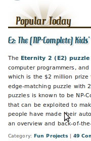
 If you are one of the 32% of GrokCode readers on Windows XP, the fonts will be rendered poorly. This isn’t just a problem with GrokCode or web pages in general – Windows XP is just bad at fonts. I had no idea that the problem was this bad until doing cross-browser testing, and I used to use XP quite often. I had to modify the original design so that it would be readable on XP (I believe Vista and 7 are better).
Have a look at the side by side of Ubuntu and Windows XP. You are looking at the difference between aliased and anti-aliased text.
Other than that, I think everything is working fine. If you see anything strange or something doesn’t seem to be working, please let me know via comments or email. Friendly advice and constructive criticism on the redesign are also welcome.



Discussion on
Meta: The Anatomy of the GrokCode Redesign
by Jess Johnson in Extras
4 Comments
4:20 pm UTC, 2011-02-10
4:22 pm UTC, 2011-02-14
4:26 pm UTC, 2011-02-21
4:38 pm UTC, 2011-02-21Leave a reply